Tables provide a structure in which to place rich content, and are often an invisible element of an email. This blog will show you how to create a basic, centralised email using a table layout.
Tables were originally designed to display tabular data, which you’re very much used to seeing. Think spreadsheets, statistics, timetables etc. and you’ll be in the right place. Below is an example of a table being used to show a comparison between two products:
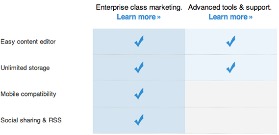
Trying to layout this complex tabular data on the web without some kind of display system in place would be a nightmare, and this is where HTML tables step in. They allow web designers to quickly mark-up and display data online with minimum fuss.
Soon after tables were introduced, web designers realised that you could place any web content within them. Because of this flexibility, tables were quickly appropriated for laying out entire webpage designs.
Fast forward to today, and CSS has completely replaced tables for web page layout. Suggest a table-based layout to a modern web designer and you’ll be on the receiving end of an exasperated sigh and accompanying lecture.
However, as I touched on last week, the email systems of today have very poor CSS support and rely heavily on tables in order to display content.
This isn’t nearly as much of a deal breaker as it sounds. I’ve been working with email for years, and I’m still surprised by the amazing examples of table-based design work that land in my inbox. I’ve found that the restrictions placed by tables actually help to drive my creativity rather than limit it.
Having said that, I do find drag and drop email editors to be extremely limiting, as they’re often based around shared template elements. This means there’s a good chance that your emails look a lot like other peoples, and won’t stand out too well. Building your own email template is a surefire way to create something that’s not only unique, but also fits your requirements perfectly.
A Basic Table
Ok, here we go! So you can get the jist of how this whole table malarkey works, we’re going to create a simple 2 x 2 cell table.
Tabular data is displayed in a series of cells, which are laid out in columns and rows. Let’s have a quick look the code that makes this all possible.
All tables start with an HTML table tag (<table></table>), containing table row (<tr></tr>) and table data tags (<td></td>) to denote rows and cells.
This is the code for our 2×2 cell table.
<tr><td>Cell one</td><td>Cell two</td></tr>
<tr><td>Cell three</td><td>Cell four</td></tr>
</table>
And this is how our resulting table looks. Harken to the mighty roar of it’s 2 x 2 cell glory!
| Cell one | Cell two |
| Cell three | Cell four |
Using Tables to Layout the Basic Structure of an Email
Now we’ve got the basics down, let’s look at using tables to construct an email. We have a bullet-proof template that we use to centralise email content, and I’d like to share it with you. It will guarantee that your email content will be centrally displayed in all email clients.
Below is the code for what we call our “container” table. It’s the solid foundation that all of our other tables will be placed into (otherwise known as “nesting”).
To avoid any rendering issues, it’s best not to nest a table more than four tables deep. Have you seen Inception? It’s sort of like that.
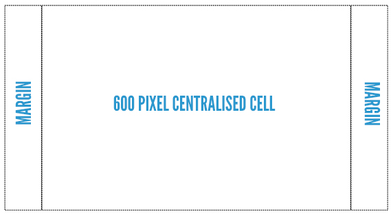
Our container table consists of one row and three cells. The cell in the centre will contain our email, and will be set to a fixed 600 pixel width. The two outer cells will act as expanding margins, keeping our centre cell in the middle of the screen. These margins will have no set width, but instead will be instructed to fill the rest of the available screen width evenly, therefore centralising the middle cell.
This adaptive width technique is known as a ‘liquid layout’ as it changes to fit the screen it’s being viewed on.
The <table> tag has a new width property in it. This has been set to 100%, so the table will expand to 100% of the width of whatever window it is being displayed in. This is perfect for our outer two cells, but we don’t want our central cell to expand with the rest of the table.
To stop this, I’ve put a width of 600 pixels on the centre cell. This will force the cell to stay at a 600 pixel width, and the two outer cells will expand to fill the remaining width of the window. This has the effect of keeping the centre cell in the middle of the window, no matter what email client/web browser it’s being viewed in. Very nifty!
<tr>
<td> </td>
<td width=”600″>(email content)</td>
<td> </td>
</tr>
</table>
You may have noticed a couple of extra bits and pieces have snuck into the code above. Namely cellspacing, cellpadding and What an earth are they for?
cellspacing refers to the space in-between each cell.
cellpadding refers to padding space inside your cells.
For example, a cellspacing of 5 will insert a 5 pixel gap between all of your cells, keeping them all 5 pixels away from one another.
Similarly, a cellpadding of 5 will create an invisible inner padding that pushes the content of your cells 5 pixels away from the inner border.
We recommend keeping both cellspacing and cellpadding set to 0, otherwise you’ll see gaps in-between your content.
Finally, is the code for a space, as in the space that you get when you hit the space bar on your keyboard. The very same spaces that joyfully fill the gaps in-between the words adorning this very blog post. Yes, those spaces. Got it? Good. Always tricky to explain that one.
Some email clients don’t take kindly to blank cells, and have a nasty habit of collapsing them. To get around this we place spaces into the cells to stop them from being collapsed.
Putting Dinner on the Table
Our centralised table has been made, and now it’s time to put dinner on it. And by dinner, I mean a big beefy bit of email content (Ahem…I’ll kill the terrible dinner table pun right here).
Our content table is going to be nested inside the cell in the centre of our container table, keeping it nice and centralised.
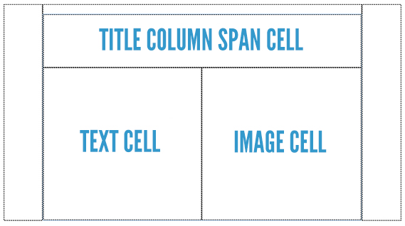
It’s going to consist of two rows, two columns and three cells. Yes, you read that right, not four cells, three cells. Let me explain.
The bottom row of our table will contain two cells. One on the left for some text, and one on the right for an image. This will create two columns.
The top row is going to contain our email title and will be a bit special. It’s going to contain one cell that spans across the two columns below. Crazy I know. This is called a “column span” and looks a bit like this.
<tr>
<td colspan=”2″ width=”600″ height=”100″>Title cell</td>
</tr>
<td width=”300″ height=”287″>Text cell</td>
<td width=”300″ height=”287″>Image cell</td>
</tr>
</table>
After creating the container table, you should be familiar with most of the properties in this content table, apart from the new ones!
The first new property is our friend the column span (colspan), I’ve set it to 2 so the top cell spans across the two columns below.
The second new property is height. I’ve inserted a couple of pixel heights in here to space things out a bit and make them easier to see.
Content Is King
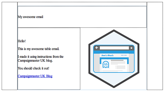
Now we’ve nested a content table inside our container table it’s time to, you know, actually put some content in there.
I’ve added in our title, a paragraph of text, a link and an image. Things are shaping up, but are still looking a little bland. Let’s add some styling to our email.
What a Difference Some Styling Makes…
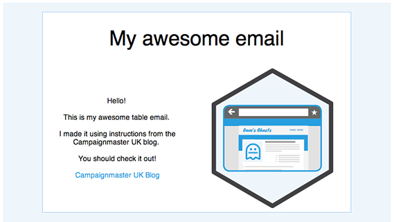
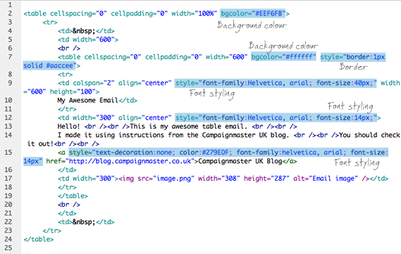
Woah! What’s happened here? A little styling goes a long way, as you can see it’s totally transformed the look of our email. For a full-breakdown, check the coding graphic below.
As this post is about working with tables, I’m going to keep it simple and only explain the final change we have made in our table code, and that’s the addition of the align property.
The align property allows you to specify the horizontal alignment of your cell, left, right or center. I’ve added a center alignment on the title and text cell, so the content appears centrally aligned.
You can also add a valign property to control the vertical alignment of your content, either top, middle or bottom.
By default, all cells have an align value of left and valign value of middle.
And that’s that! You can take a peek at what the whole thing looks like in real life here. If you’re anything like me, you’ll also want to have a good hard look at the raw code too, which can be downloaded here.
Stack attack!
When I’m doing any HTML code work, I try to stick closely to the KISS principle, and keep things as simple as possible. This is especially true with tables.
You should always keep your table designs as basic as you can. I can guarantee that having one massive table riddled with colspans and rowspans will come back to bite you. They are unstable, a pain to edit, and will cause you all sorts of avoidable grief when you come to testing with different email clients.
If you’ve got a complicated table in mind, my advice to you is to split it horizontally into a set of smaller tables, a process known as stacking.
Stacked tables are more stable, easier to edit and make you look more attractive.
