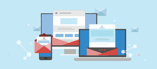
Recently we looked at how effective pop-overs can be when capturing new subscribers. If getting these subscribers is your first step; a welcome email should definitely be your second. This week we’re taking a look into the practice of using welcome emails, as well as providing tips on designing or improving your own. But first off, what exactly is a ‘welcome email’?
A welcome email is automatically sent to a new subscriber or customer as soon as they’ve been added to your email list. Whether they have just created a new account with you or signed up via an email form, a welcome email is sent to confirm their subscription and let them know what to expect from you in the future.
Your welcome email is the first impression a subscriber will have of your email program, and possibly even your brand. Therefore it’s crucial that you make a good (and hopefully lasting!) impression on them. But how do you do that? What makes for a good welcome email? Or even, what makes for a bad first impression?
This week we’re taking a look at six different brands across several industries and assessing their campaigns against our welcome email checklist.
Note that this checklist is only a guide. You can use some or all of the the tips lists here, they are not all necessary. The trick is to use as many; or a few as you feel appropriate for your particular industry.
Welcome Email Checklist
Let’s start with the essentials:
Start with a Warm Welcome
Thanking new subscribers upon sign-up is a great way to get things started. As they have just signed up they’ll have a high level of interest in your emails, so it’s the perfect time to give them more information on your company.
Click-Throughs
Use your calls-to-action well. A good welcome email will introduce your company, and a great welcome email will give subscribers somewhere to go too e.g. your online store or product catalogue.
Use Images Well
They say ‘a picture speaks a thousand words’ after all, so make sure your images are well chosen and appropriate for your brand.
Now lets talk optional components (these may enhance or detract from your email depending on audience and market):
Tell Them What’s in Store
Let subscribers know what to expect from your campaigns and how they will benefit from them (if you’re up on your marketing lingo this is know as your value proposition). This will help subscribers appreciate the value your emails and make them more likely to open them in the future.
Manage Expectations
Inform new subscribers how often they will receive emails from you. If you have additional email channels, let them know this too. For instance Mr Porter (shown below) highlight their “What’s New”, “The Bulletin” and “The Trend” email channels and specify which days these will be sent.
Sales
Personally, I would avoid selling too hard in your welcome email. It’s best to welcome subscribers, thank them and let them know how often you’ll be sending them emails. If you want to do some selling, keep it light.
Six Examples of Great Welcome Emails
So we could get a good idea of how welcome emails are being used, we signed up some from a cross-section of industries. These included retail, publishing, entertainment, tourism and more which can be applied to both B2B and B2C scenarios. Below are six examples the best welcome emails we received.
Schuh

Schuh are a UK based footwear retailer. They don’t have too many points on the checklist as they have opted for a minimalistic approach; however, this email is perfectly on brand. Their welcome mat image couldn’t be more relevant; and as such provides a nice warm welcome with a good use of images.
The main drawback here is that by using a sparse design with an emphasis on images, Schuh will be alienating subscribers who have image blocking enabled, so this is a little risky.
Schuh get 3/3 for the essential points in our checklist, which is great, but 0/3 for the optional. The minimalistic approach works well and is appropriate for their target audience. However, they could have used the opportunity to emphasise the value of their emails/how often they will send then and/or influence sales.
National Geographic
National Geographic have a well-designed and informative email. They cleverly welcome you to their ‘community’; making subscribers feel included and wanted.
They let you know about what you can do now as well as offer you a free download of their e-book Guide to Photography and then finally offer you three clear ways to ‘get started’.
Very well designed and ticking lots of boxes from our checklist:
- Warm welcome, check.
- Great use of images, check.
- Calls-to-actions, could be more prominent but good overall.
- Value of emails, definitely check. This is brilliant for value; they immediately call you part of the ‘community’ and show you ways you can interact with others that share the same passion. ‘Members centre’, ‘Your shot’ and ‘Comments’ all encourage engagement; not sales, which is a good tactic.
- Manage expectations, check.
- Sales, intentionally avoided (and well chosen).
This clever email gets a 5/5 (sales excluded as intentionally left out by them)
Mr Porter

Mr Porter’s design is a great example of a well made retail/fashion welcome email. It thanks you, uses good imagery, sets expectations as well as explaining the value of their ‘style bulletins’.
Their main message, surrounded by appropriate fashion imagery, informs you when to expect emails from them: “What’s new (TUESDAY)”, “The Bulletin (THURSDAY)” and “The Trend (SUNDAY)”. This is a good strategy as subscribers know exactly when to expect their emails and will therefore be more likely to engage with them as well as see their value.
What’s clever about it, is that most fashion/retail companies use their welcome emails to immediately shove products and prices in your face. Mr Porter stays classy as ever, by providing plenty of calls-to-actions to their website and specific pages, but this is very soft selling as they do not place any products.
They quite literally tick all the boxes; a well deserved 6/6. Fashion companies take note.
Playstation

Playstation have a professional looking, well designed email. They welcome subscribers to the ‘World of Playstation’ and use a very well designed collage of characters from a range of games to evoke consumers to reminisce. There is a good call-to-action stating ‘Find out more’.
They use a lot of product placement, however this is all below the fold and won’t drive subscribers away. Sadly, expectations aren’t really given nor do they particularly mention the value their emails have. I’d give this a respectable 4/6.
Visit London

VisitLondon is appropriate for the events/tourism industry. It has a good landscape image of London with multiple calls-to-action in the top navigation bar. While navigation bars have their purpose they are often glossed over by skim-reading subscribers, and I can’t help but feel that this email would benefit for a more prominent call-to-action at the bottom of its introduction.
Interestingly, they provide an unsubscribe link both above the fold in the main content and also at the bottom as standard. This isn’t exactly bad practice, as it will help to keep their lists clean. Below the fold, subscribers are encouraged to click-through to the Visit London website. It’s a 4/6 for this email, it is appropriate for its industry and does what’s needed.
Innocent

Smoothie lovers innocent keep the tone of their email light, which suits their brand perfectly. They tell you when to expect their emails, and literally signpost where to go next with a clever series of calls-to-action.
There isn’t a thank you mentioned per se and they don’t really give any indication to what the subscriber might gain from their emails. It also looks like there was a formatting issue with the opt-in link at the bottom of the email – teaches us a little lesson on proofreading, whoops! Overall, it’s a good email and works for their brand, but I would only give this a little disappointing 3/6.
What to Take Away from This
On the whole it’s best to keep your welcome emails succinct and to the point.
Remember, this is the first email that your subscribers will receive from you and its purpose is to confirm their subscription, give them a warm welcome and let them know what to expect in the future. You work hard on your emails so it’s important to let subscribers know the value of them too. Their first ‘proper’ email from you is yet to come, so you don’t feel that you need to provide too much more.