I personally receive a lot of emails on a daily basis and I use my commute to work as the perfect time to trawl through these. I am generally interested in the content of all the emails I receive so I do take the time to read through the majority of them. However, the minority I don’t read are usually not read due to poor design. Not only that, but as I’m on the go, I am reading them on a smartphone and therefore design is paramount in order to get me to read the entire email, let alone interact with any calls to action! In order to get the most out of your email campaigns, it is important to get all elements of your design looking sharp and we at Campaign Master (UK) Ltd have a few tips that can help you do just that.
Mobile-First Approach
Not all email campaigns are designed to be optimised for mobile, especially internal campaigns, but with more and more emails being accessed on mobile devices, it should at the very least be a consideration. As we previously discussed in the evolution of smart technology article, 88% of people check their emails via a mobile device so ensuring your campaign displays correctly and effectively on these devices should be a priority.
The content of your email should be legible at arm’s length which means bigger fonts, larger calls to action so that the average thumb can interact with it and optimised images for quicker load time. The other key point to cover when considering a mobile-first approach is the general layout of your email design. Sticking as close to a single column layout as possible means that your email should display better on a smaller screen than a multi-column layout. Although this doesn’t mean your email is fully responsive, it does go a long way to improving its readability. If you didn’t want to tackle responsive design, attempt to use percentages where possible instead of fixed pixel dimensions as this will result in your content adapting for all screen sizes.

Content/Call to Actions
Although the design of your email is a huge point to cover, going back-to-basics should be a priority and ensuring your content is not overshadowed by an all singing and dancing design is key. The expected reason for a recipient signing up to your campaign is that they have a genuine interest in the content and what you and your company have to say, so make sure they can take that information in. If your aim is to get call to action interactivity, make sure these are clear and in a prominent location. A general rule of thumb is to have at least one relevant call to action above the fold and all of your content should fit within a 600-700px width. Finally, make sure there is something for everyone in your email. If a reader doesn’t want to interact with anything that only appears in one particular campaign, give alternative, generic links such as your company’s social media channels.
Branding
There are a lot of unwanted emails out there and when they land in our inbox, they are sometimes not as obvious as we expect. For this reason, branding is massively important as not only does it express your company’s public image, but it also provides comfort for the recipient. If a reader can recognise your branding, and this includes a branded from address and from name, they are more likely to trust your email and therefore read it. Stick to your brand guidelines as much as possible to achieve this result. In order to accomplish a safer design, it’s a general recommendation that you should stick to a small collection of your brand’s colour palette.

Text to Image Balance
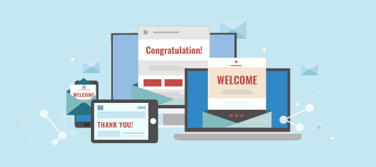
Images are arguably the most eye-catching element of a HTML email. When images are used, they should be clean, appealing and relevant. However, one large image or a heavily image based email serves up several problems. Emails that make use of this method are widely associated with spam and therefore a lot of email clients will automatically associate a very image heavy email with the spam folder. In addition to this, recipients will more than likely be asked to download images to view the email properly. If the email client features a preview pane such as Outlook does, recipients may choose not to download images and therefore they will not be able to see your content as you intended.
Achieving a good text to image balance is vital in avoiding these problems and improving your email deliverability and there are a couple of ways to improve this situation if you find yourself in it. Firstly and most obviously, use text where possible. Try to avoid images of text and use actual text instead, making use of safe web fonts to ensure it displays properly. If images can’t be replaced, adding alt tags is a way of balancing out your ratio and this will provide text to be displayed if images are not downloaded by the recipient. In addition to alt tags, background colours for cells containing images will act as a back-up for non-downloaded images. This technique is especially useful for features such as buttons as a matching colour from your button image can be used as your background, almost making the non-displaying image unnoticeable.
Testing
The final stage of a good design and perhaps the most important is testing. Your email design should be tested vigorously, and then tested again. Testing should not be undervalued and you can never do too much testing. Unfortunately for us email marketers, all email clients and devices seem to vary in some way or another with regards to how they read and display your HTML email. Due to the variation of devices and email clients currently in circulation and with this only set to increase as time goes on, it is important to test how your email looks on these different platforms. Analyse who your campaign is going out to in order to understand what email clients you should be mainly targeting. An alternative and easier way of ensuring your campaign looks crisp across a huge variety of clients is by using a rendering tool. Campaign Master (UK) Ltd offers this feature and allows you to test how your email looks on 31 different clients and devices. If you would like a demo of this feature or feedback on how your designs look, get in touch with our team.