Your email campaign is ready and looking good to launch. You’ve inserted your high res images, produced engaging content and created an attention grabbing subject line. The campaign is launched and you are seeing your opens go up thanks to your subject line however, you’re not getting many clicks. This means, your email is not increasing traffic to your website and your offers and invitations are being ignored. Maybe it’s time to look at whether you are using your calls to action effectively.
There are three methods of inserting CTAs that we can use and these are HTML, pictures or VML (Vector Markup Language).
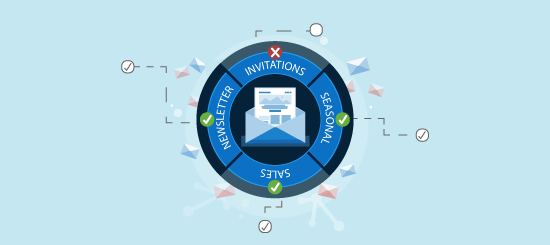
Understanding Your Audience
Before you set out to design your CTAs, you need to do a bit of homework and understand your audience. From a design perspective, you need to establish what email clients are popular amongst your database. If you are sending to a B2B audience than an educated guess would be that Outlook is your most popular client. If you are sending to a B2C list then your target audience is likely to be using iPhones, iPads, Gmail, Hotmail etc. By the way, you don’t need to play a guessing game with this as Campaignmaster offers Advanced Analytics that can tell you the most popular email clients amongst your database.
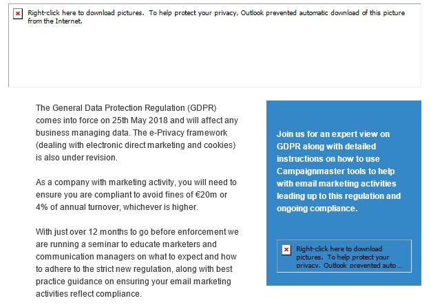
So why should you take into account what email client your emails are being opened in? Well if your readership is using Outlook, then they are required to download images. So if your main call to action is an image, this is what they will see:
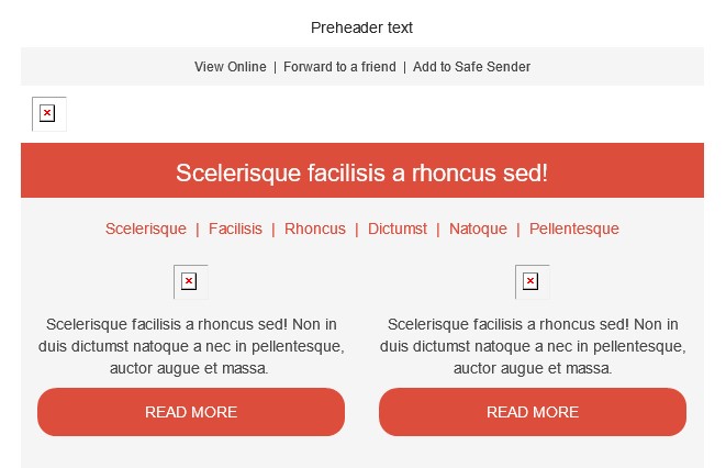
This is how the campaign appears after the pictures are manually downloaded.

HTML vs Pictures
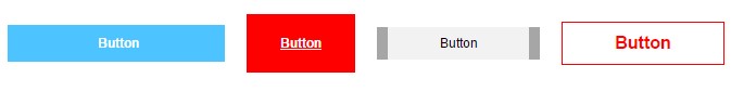
Given the above you would consider using HTML only to create them. If you are a Campaignmaster client, then you have the option of using our drag and drop editor where you can simply insert ready-made HTML buttons into your campaigns. You can even customise them to suit your email creative.
HTML buttons are easier to manage going forward as you do not need a designer to update the text, meaning you can change them per campaign and keep them relevant to your content.
This is all well and good for Outlook but most other email clients, (Apple Mail, Gmail, etc.), images will be displayed by default. Based on recent stats, most opens happen on mobile devices nowadays and Apple devices are the most popular of these mobile devices. In fact, according to Litmus the top email client of July 2016 was actually the Apple iPhone.
So if you are willing to discount Outlook, and would like CTAs that really stick out with gradients and graphics, (make those designers work hard for their money!), then you can go with images.
The Goldilocks Solution
Another method which may be more appealing to you is the use of Bulletproof buttons. This method completely avoids the use of images, making it easier for you to create curved CTA buttons in your campaigns going forward. Bulletproof buttons use a combination of HTML, VML and CSS code to allow for the CTA buttons to display without the recipients needing to download the images, which refers back to the name “Bulletproof”.
Luckily for Campaignmaster users, our fully comprehensive drag and drop editor allows you to easily insert and edit these VML buttons as well as making them mobile responsive.
Don’t Know VML?
Not to worry, there is a middle ground when it comes to designing HTML buttons that will allow you to tailor for all of the major email clients. This solution is a combination of text and HTML. With this solution you create the core part of your call to action using HTML, so even if images do not display the main click through is visible. In the example below, the text section is HTML and the rounded corners are images:
This will help you cater for all major email clients meaning you do not miss anyone out.
Ergonomics
Once you have decided what method you plan on using to create your buttons, you next need think about how to get your recipients to click on them. This then comes down to ergonomics. Your CTA’s need to be visible and stick out. Here is a nice example:
The buttons are big and to the point. They stand out from the background colour and you really can’t miss them.
Now the idea of understanding your audience comes into play as well, as discussed earlier, majority of opens happen on mobile nowadays. So you have to ensure your CTA’s are visible on mobile. Think of the following:
- Are they big enough to be pressed by the average human thumb?
- Is there enough space around the main CTA to keep it apart from other links? It’s easier to press the wrong link on mobile if they are too close together. So make sure you have enough padding around your CTA.
- How far does your recipient have to scroll down before seeing the main CTA?
- Try and keep your emails short and your CTA above the fold.
Content
So you have now decided between the type of button you will create and how it will look. What is equally important is the text you put over it. Consider the following:
- Does the text carry the message of your email? ‘Click here’ is boring and generic and boring (again). Try and keep the content relevant. If you are advertising an event, try ‘book now’ or ‘register here’.
- Create a sense of urgency by using words like ‘now’ or ‘limited places’
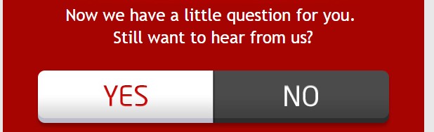
- If you are looking for feedback, ‘yes’ or ‘no’ buttons can be more efficient than sending recipients off to a feedback form.
The content of the CTA can make a real difference, so avoid generic terms and give your content a thought.
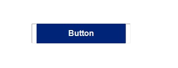
You can create great looking CTA buttons using tables in your campaign, such as in the example below:
What if you want to create curved buttons? This is something we can do by combining both techniques we touched upon earlier; using pictures and HTML. Using this method will help keep the call to action visible even if the recipient does not download the pictures in Outlook.
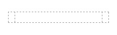
To create curves on the call to action button, you would need to slice the left and right side of the button.
![]()
After you have your two slices, you would need to create a three column table in your campaign:
Insert the images on the left and right cells:
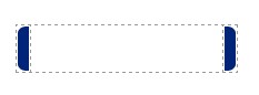
Finally add the colour and the text to the middle cell.

This is how the call to action button appears in the campaign when pictures are not downloaded in Outlook. As you can see the call to action still remains visible for your recipients to interact with.
This is how the call to action button appears in the campaign when the pictures are downloaded in Outlook.

It’s really important to consider creating clear CTA buttons in your campaign using either HTML, VML or a mix of HTML and pictures. The clearer and more accessible your call to action buttons the better your results will be!
As mentioned earlier, we’re all about making email marketing easier for everyone and so our fantastic drag and drop editor has ready-made buttons for you, which you can customise to suit your branding.