Historically, fonts in email have been limited to a set of common web-safe fonts installed on all devices. This means that unless you’re particularly fond of Arial or Times New Roman the choices have been rather small.
However, I recently read a few great primers which point out that it’s possible to import Web Fonts into several mobile email clients. Web Fonts are freely available fonts that are hosted online.
Personally, I find this pretty cool! Being able to import any font you need into an email is fantastic, and is sure to inspire some really nifty designs (which I’m now keeping an eye out for). Using a Web Font rather than an image will ensure that your text can still be viewed with images off (albeit in a fallback state), and will stay pin-sharp on all HD devices.
In this example we’re going to be using Google Fonts to breathe a bit more life into a mobile email.
Just a Little @Import…
I’ve chosen two fonts that I want to import from Google Fonts, Lobster & Droid Sans. Obviously you can use any font you like. Once you’ve made your selection, go to the ‘use’ button in Google Fonts and click on the @import tab. You’ll see a snippet of code similar to the one below.
This section of code will pull the fonts you’ve selected from the Google Fonts server and into your email. Place this code at the top of your CSS style tag. Beneath this, you can style your campaign as usual.
font-family:’Lobster’, Georgia;
font-size:60px ;
line-height:55px;
color:#FFFFFF;
margin:0;
}
I’ve chosen to add my Web Font to a heading style, so in my HTML body I’ve added a heading tag with some text to apply it to.
I did the same again with my Droid Sans font and added a table for some structure. You can see the HTML email here and code here.
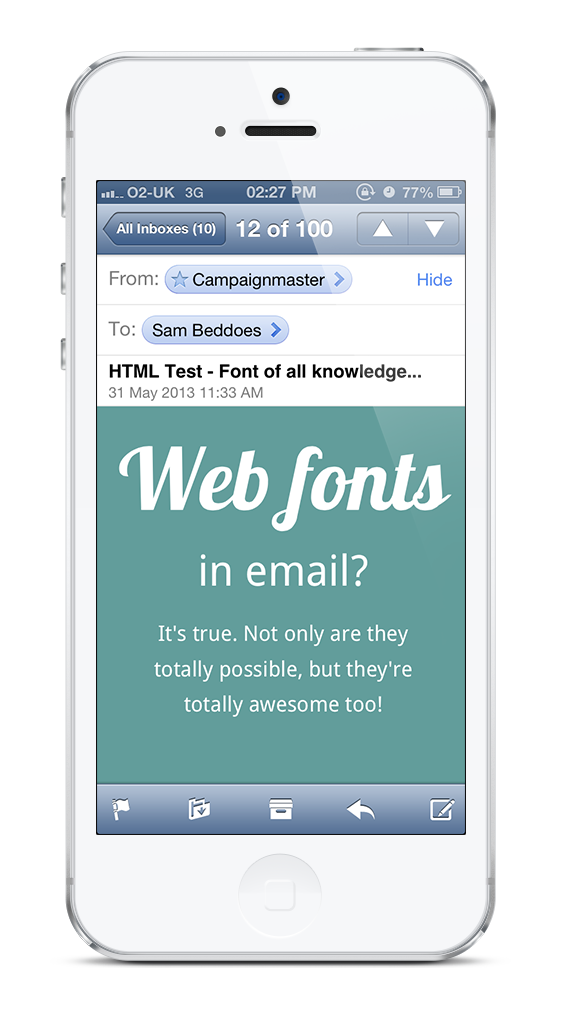
Below you can see the fruit of our efforts, a rather tasty looking bit of email typography on an iPhone 5. This method works well on Android too.

A slight downside to the @import method is that it (surprise!) isn’t supported in Outlook. Instead of using our fallback option of Georgia or Arial, Outlook has a bit of a panic and goes all Times New Roman on us. Whoops.
As we’re targeting these fonts on mobile only, we can easily get around this by placing our web font CSS styles within an @media query. This way, your web font can still be viewed on mobile devices and Outlook will happily use your alternative font. You can see a full example here with the code here. To see the mobile optimised text change, re-size your browser width to less than 480px wide.
h2 {
font-family:’Lobster’, Georgia;
font-size:60px ;
line-height:55px;
color:#FFFFFF;
margin:0;
}
}
Extra Styling
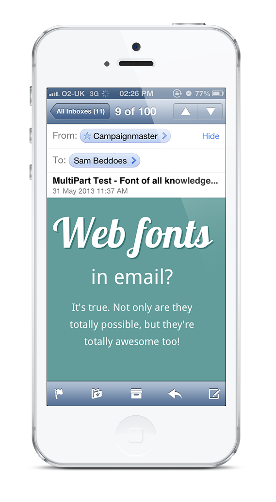
Another cool feature of using mobile targeted CSS is the ability to use extra styles that aren’t supported by a lot of desktop clients. Below you can see I’ve used the text-shadow CSS selector to add a shadow to my main title. Quite a nice little effect! Text-shadows are supported on iOS devices and some Android devices.

A Brighter Future
Traditionally, coding for email has been stuck in the past, but with this new wave of standards compliant mobile devices, things have suddenly leapt into the future. Trusty old HTML 4 table tags are now bumping shoulders with shiny new @import CSS selectors and HTML 5 Video tags. Sure, you still need to code to appease the lowest common denominator (I see you Outlook!) but it’s incredibly refreshing to see email evolving into something more modern.


