If I’m scanning through my inbox and come across a well-designed ‘images-off’ email, I get a little bit giddy with excitement.
As I’m sure you’re aware, many email clients block images by default. While some are starting to break the trend and download images automatically (Hello Apple Mail & Gmail), a sizeable chunk still persist on blocking (Outlook, Yahoo, Lotus Notes).
At first glance this blocking is a bit of a pain, but in reality it’s something of a secret weapon for email marketers. It provides an extra opportunity to add design elements that entice a subscriber to download images or use a call-to-action.
So you can see what I mean, I’d like to show you the difference between two emails I’ve received recently, both with images off.
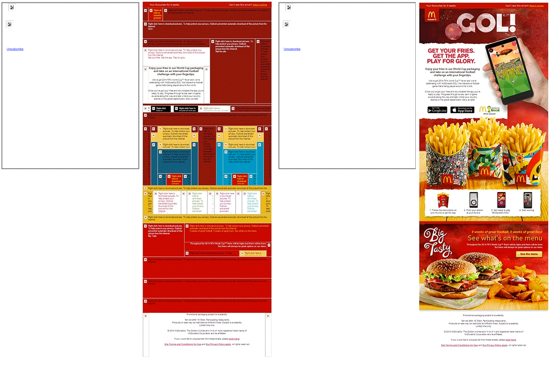
On the left, a nameless company, on the right, McDonalds (images off & on). Which would you find more enticing?
Whatever your nutritional preferences, you have to go with McDonalds right? Let’s look at why.
The email on the left it comprised of two images, and that’s it. Those images contain all of the email’s content. Text, calls-to-action, links, you name it. When these images are turned off, you’re left with a big blank, broken looking email.
Compare this with the McDonalds email, and there’s a huge difference. For a start the main text is typed into the email, and not embedded in an image. The text is formatted in different sizes and colours, and the images are sliced into different tables. These tables have then had background colours applied, and McDonalds have even made a little mosaic of their fries (that’s chips to you & I).
As a subscriber browses through their inbox, you can see which of these emails is going to be more enticing and easier to engage with.
To help get your creative juices flowing I’ve put some of our favourite ‘images off’ emails below. If you’d like to get your own template optimised for ‘images-off’, our design team are happy to help!
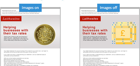
First off, a great B2B example from Laithwaites accountants.
Next up, two ace examples from Pizza Express.
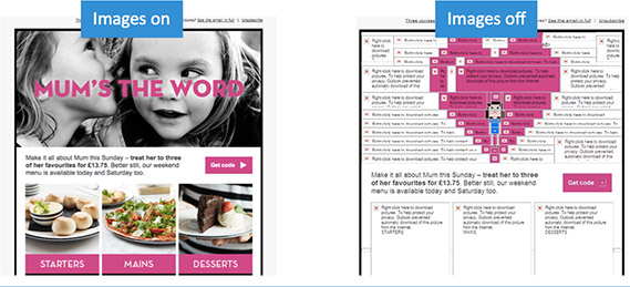
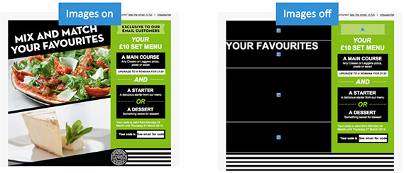
As you can see these examples are a huge improvement from the broken looking email we looked at earlier. Even with images turned off, all their main elements are clear, visible and make it very tempting to switch images on. Plus, even if images are never activated, these emails can still be engaged with.
Fancy giving your email an ‘images-off’ makeover? Get in touch!


