In this post we will delve into examples of live preference centres and unsubscribe pages to see what we can learn from what’s currently out there.
Groupon
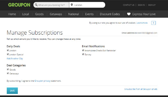
First up is Groupon’s preference centre. There are a lot of positives here, but those very positives can be construed as negatives, depending on the audience.
Off the bat, as soon as I come to the preference centre, there is too much going on. My eyes need to adjust to the multitude of options available on the page. Now, for someone like me who deals with emails, webpages and forms for a living, it’ is easy to quickly make sense of it. But it might not be as simple for someone less acquainted with the internet.
The page reflects the website, so to a regular subscriber it will be familiar, which is never a bad idea.
The search bar at the top is a good distraction, a way to divert my attention from unsubscribing and instead searching for a deal; who doesn’t love a good deal!
The manage subscription options are specific to my location and give me the chance to add another city, which in affect could leave me wanting to receive even more emails than before, even though I came to the preference centre to unsubscribe. Quite ingenious.
The options are broken down well, so as to retain as many subscribers as possible. More importantly, it will help Groupon send me more targeted emails and understand their subscribers better.
So, the various options on this page are great and at times sneaky, given how I am easily distracted, I could decide to visit their website instead of unsubscribing, end up opting in for even more emails then before, or I could simply be put off by all that’s going on here and end up chucking the next email into my junk folder. This in turn would be bad for Groupon’s reputation as a sender.
Moral of the story: if you are creating a preference centre with a multitude of options, keep your layout simple and easy to understand. If you incorporate the design of your website into the page, don’t lose sight of the main objective, which is to give your readership a chance to manage their preferences easily. All in all, keep it simple and easy to use so you don’t end up in a junk folder.
Booking.com
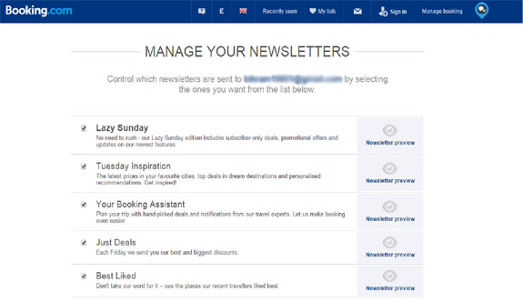
For me, they have hit the nail on the head with their preference centre.
They have incorporated their header, so I get the look and feel of their website with a few options, most of which are specific to me:
Despite this, the focus remains on the preference centre with a nice big heading and centre aligned content:
Each type of newsletter has a unique name, instead of just ‘newsletters’ and ‘events’ they use ‘lazy Sundays’ or ‘Tuesday Inspiration ‘, making the newsletters sound more interesting and appealing.
Possibly my favourite part of any preference centre I have seen is the newsletter preview icon:
For one, it’s well laid out and designed, and secondly it shows me a live example of what I could be missing out on. Remember, just because you understand the categories for your email campaigns, doesn’t mean your readership will. So the preview option is an ingenious inclusion.
Scrolling down to the bottom of the page, the option to unsubscribe completely is very apparent and hard to miss:
The apology is a nice, sympathetic touch.
So in conclusion, I think Booking.com have hit the nail on the head, their preference centre is clear, concise and to the point.
Londonist
Preference centre is not always the way to go when it comes to managing unsubscribes. Yes it may help you retrain a few subscribers but you are running the risk of ending up in junk folders, which is ultimately worse than an unsubscribe.
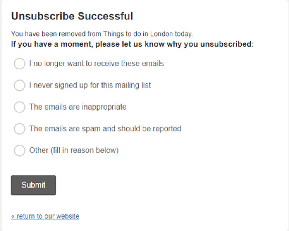
Londonist have taken a different route. They offer a one-click unsubscribe, which will be a relief to their readership who will be grateful for the easy unsubscribe and hence more inclined to provide the simple feedback request that follows:
This simple feedback form is a great way of understanding why someone has unsubscribed, and though you are not retaining subscribers, you now know what mistakes you made so you can rectify them. Although, I would possibly take a different line of questioning. Maybe ask the recipient if they did not receive what they were expecting when they signed up or if the content was too generic and not for them etc.
In conclusion, feedback questions are a great way of understanding why a recipient has chosen to unsubscribe, and a good way to learn from your mistakes. Almost like asking an ex for feedback at the end of a relationship so you do better next time around!
Noddle
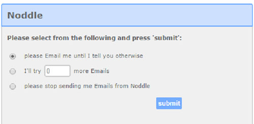
Sticking with the analogy of ending relationships, Noddle are eager for the relationship to not end, hence they are asking for a second chance:
This is quite a unique take on unsubscribes. Noddle are asking for a second chance, which is in my control. I can decide to, firstly give them a second chance and secondly how long for. It’s a good idea, as they make their subscribers feel in control which isn’t easy to do when we receive so many emails on a regular basis that we feel it’s out of our hands.
The page itself is simple, a bit too simple for my liking. There is a lack of branding and no links off to their actual website. They are in affect losing the chance to drive traffic to their website, as a marketer you shouldn’t miss out any such opportunities.
Conclusion
- Preference centres are a good idea, but they need to be simple and to the point. It could be your last opportunity to salvage the relationship, so you want to be interesting and unique, but at the same time do not come on too strong.
- Have a ‘unsubscribe from all’ option that is easy to see.
- As Booking.com has done, use large headings that get the point across to the user.
- Offer options that are specific to the recipient, like Groupon offered me the option of staying subscribed to all communications based on my location.
- Mostly importantly, try and understand why the recipient wants to unsubscribe, is it the frequency of emails? Or the lack of relevant content etc.
- Getting feedback will in the long run help you understand your subscribers better, and deliver email communications that lead to a better ROI.
