In the world of email marketing, design trends are ever evolving.
One trend however, that is very effective are Outlook or plain text campaigns.
What do we mean Outlook style campaigns? Great question. These are email campaigns (which are mass launched) that resemble a simple text email you would send directly from your email account. They are the embodiment of ‘less is more’ and have been proven to be successful.
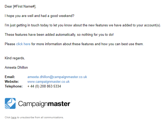
Let’s take a look at an example of an Outlook styled campaign:

It resembles a direct email right?
The whole idea of creating this style of email campaign is to encourage recipients to engage with the email, by making it seem as though it was sent directly to them, rather than mass launched to a mailing list.
This ‘direct’ form of communication establishes trust and a more personal connection with your recipient, which can lead to them engaging more with your campaigns – whether this is by replying to the campaign or clicking on a particular link.
With Campaignmaster you can have all replies emailed directly to an inbox of your choice.
It can be easy for recipients to recognise a mass mailing, especially when your campaign is more design based. With Outlook style campaigns, it’s difficult to identify if the email was sent to just you, or a wider audience.
However, let’s get one thing straight here – the purpose is not to mislead your audience, but to provide direct information in a more familiar and to the point format.
How to Build an Outlook Style Campaign
When it comes to building an Outlook style campaign, simplicity is key. If you’re looking for inspiration, look no further than your very own Outlook email signature. This is after all what we’re trying to replicate.
Using an Open HTML editor is beneficial here as no additional code or formatting will be applied to your campaign and so you have a nice, clean slate to start working from.
Let’s explore some key design elements you’ll want to include:
- Right at the start of the campaign you’ll want to insert your greeting. We suggest using ‘Dear/To [First Name]’. If you store your recipients first name, this is a great place to insert personalisation to make the email feel that bit more personal. This can be followed by ‘I hope you are well?’ or perhaps a ‘Happy Friday! I hope you’ve had a good week?’, based on when you are planning to launch the campaign.
- Next up we have the body content. This is where you will place the main message or information you are trying to convey. This may include images or links.
- Once you’ve added in your body content, it’s time to create your sign off. We recommend trying to replicate your usual Outlook signature here. This may include a company logo (which you should link), contact information and a sign off such as ‘Kind regards’ text.
- One link you cannot neglect in your email campaign is your unsubscribe link. Yes, this campaign may look different, but that by no means gives you the green light to leave out key (and legal) elements. An opt out link is required in all marketing messages. Usually, marketers will place an unsubscribe link in the footer of the email and so placing it under your signature seems like a fitting position.
Once you have built your email, make sure to test it thoroughly to different email clients to make sure it renders exactly how you want it to. If you don’t have access to different email clients we can provide an advanced rendering feature.
Making Outlook Style Campaigns Work Harder
You may be convinced to give Outlook styled campaigns a go, but before you start, I have some helpful tips to make sure your campaign is effective as possible:
- Personalisation
Utilise the ability to personalise your sender details to make a better connection with your recipients. For example, rather than sending your campaign from ‘news@e.campaignmaster.co.uk’, send it from ‘ameeta@e.campaignmaster.co.uk’ so the communication feels more personal.
- Default Link Style
Usually in email campaigns, we suggest to create clear CTAs (calls to actions), sometimes the more colourful the better to attract your recipient’s attention. However, in Outlook style campaigns, it is best to stick to using a blue font with an underline. Because of software’s such as Microsoft Word and search engines such as Google, we are subconsciously conditioned to think links formatted like this are credible. The more trustworthy a link, the higher the likelihood of them being clicked on. Furthermore, links formatted in this way resemble how links would usually look in regular Outlook emails.
- Using a Human Voice
The whole purpose of Outlook styled campaigns is to resemble a personal email communication. A great way of confirming this is by using a friendly and light hearted tone – just as you would if you were to email someone directly. This will help to build a connection with your recipient and will encourage engagement.
Tempted to try an Outlook styled campaign yourself? Why not use our split testing feature to adjust your content and see how effective an Outlook style campaign can be for you. Alternatively, get in touch and we can work with you to create a brand-new Outlook style template directly in your account.
Email us at info@campaignmaster.co.uk for professional email marketing support and guidance.


