The most common question I get asked by anyone looking to improve their email marketing is ‘how do we improve our open rates?’ It doesn’t matter how many bells and whistles you put into your content, your email getting opened boils down to two things; your subject line and pre-header text.
What is pre-header text?
Now if you are reading this I’m sure you already know what a subject line is, but some of you may not be familiar with pre-header text. It may sound a bit techy, (if you like techy words there are more here, but I assure you it’s very simple so don’t let the name put you off. It is, in essence a simple line of text inserted at the very top of your email.
Email clients will display the very first line of text in your HTML’s body below the subject line in the preview screen. This doesn’t extend to all email clients, some are still playing catch up. Here is an example, (not a good one), from one of those that does display pre-header text:

The pre-header text starts from the third line. The view will vary from email client to email client. This example is from Apple Mail which is now one of the most popular email clients out there.
Without knowing it, the author of this email is using pre-header text. The email client will read whatever appears first in the HTML body. In this case, it happens to be what we call the best practice links. However, this doesn’t entice me to open the email, it’s not adding any value to the subject line so it’s not really the best use of the extra space.
So, without you knowing it, all of your emails have pre-header text and the aim should be to use this as a second subject line and give people another reason to open your email.
Examples
Your subject line might be referring to the first article in your email, which may not be of interest to someone. The pre-header text could therefore refer to the second article, which may be more relevant to some of your readers.
Here is an example of Photobox making good use of pre-header text:

‘Time’s running out’ is a good use of pre-header text. The subject line has already told me I can save money (good use of emoticons by the way, read more about them here) and the pre-header text enforces this won’t last forever so get in on it now.
Looking at just the subject line I would have thought, that’s a good offer I will come back to it. Looking the pre-header text I might change my mind on waiting because I might lose out on the offer. So, it’s created a sense of urgency which is great.
My only criticism of this pre-header would be its length. There are clearly more characters available that Photobox could have used, which would have also pushed the best practice links out of the pre-header text.
Here is a really good example from uSwitch:

The subject line is talking about car insurance; I’m tied in for another 11 months so not interested. I may however be happy to consider a new energy provider. So once again I have reason to open the email which I wouldn’t have done if I only saw the subject line.
What not to do
The choice of what you use as your pre-header text will change for each campaign. What I see very often is marketers repeating their subject line in their pre-header text which is the one thing I would highly recommend avoiding, it makes you sound like a spammer and wastes very valuable space.
How does pre-header text display?
As we discussed above, the view of pre-header text changes depending on the email client.
The examples we have looked at so far are all from the native Mail app on an iPhone. The maximum number characters that will display are approximately 90.
For Apple Mail on desktops, this can be around 140 characters.
However, Apple are the most generous when it comes to the limit for pre-header text.
When it comes to Outlook desktop, only the 2013 version supports pre-header text. The amount of characters that display really depend on the size of the mailbox tab. For example, here is an email from Trainline in Outlook 2013:

The pre-header text is just ‘ride into the Christmas season’. If I increase the size of the inbox I can see more characters:
So, for Outlook it’s tough to predict how many characters will display and will vary from recipient to recipient depending on what size they set their inbox to. A safe bet would be to aim for below 40 characters.
When it comes to Gmail desktop, the pre-header text displays next to the subject line:

Therefore, the number of characters will vary depending on the length of your subject line. So, the best way to determine how many characters you are getting on Gmail is to test directly to the email client.
In conclusion, all email clients have their own way of displaying the pre-header text in your emails.
To decide how many characters you should include, it would be good to understand your readership. CMAdvantage gives you detailed views to see what email clients are being used by your recipients. You can use this information to determine the most popular ones and make sure you design and test for those. A safe bet would be Apple mobile mail app if you send B2C emails and Outlook is the most popular if you send B2B emails.
Can you hide pre-header text?
Once your recipient opens your email they will see the pre-header text at the very top, but you don’t have to leave it visible. There is limited space to work with on a mobile phone, so CMAdvantage offers you the option to hide your pre-header text on mobile views. The point here is, the pre-header text doesn’t have to be visible in the email for it to display under the subject line.
Correct way of inserting pre-header text?
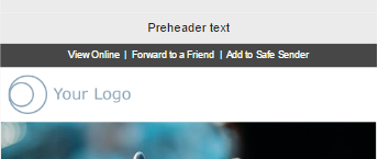
At the risk of sounding like a broken record, the pre-header text goes before anything else in your email:

The length of it, the alignment is entirely up to you. Just remember to follow what we discussed above in terms of the length.
If you choose to hide your pre-header text you can do this using CSS. All you need is to add the ‘display: none;’ property to the style of the containing cell.
Our recommendation would be to hide the pre-header text for mobile. You are very short for space on smaller devices.
So, for example, here is how my email looks on mobile with pre-header text showing:

This is how it looks when it’s hidden:

By hiding it you are recovering the space the pre-header text takes up. It’s not a lot but moves up your content and means less scrolling for the recipient.
How to measure the benefits of pre-header text
The answer to this is very straight forward if you are a CMAdvantage user. The best way to measure the success of your pre-header text is to use our brilliant split testing feature. You can create one version with pre-header text and another without. See which one gets the better open rate and use that to decide whether or not you should be including pre-header text in your emails.
Conclusion
So, in conclusion, the purpose of pre-header text is to improve your open rates by adding to your subject line. It allows you to give more information about your email to your recipients before they even open it.


