The London 2012 Olympics campaign was my email of the year for plenty of good reasons, but it was its exemplary attention to accessibility that really won me over. So, sharpen your pencils, spit out that gum and join me in discussing accessibility.
Good email design will always cater for the broadest spectrum of subscribers. This includes subscribers with accessibility requirements. Ensuring that subscribers with disabilities can perceive, understand and navigate your campaign is something that all email marketers should strive for.
A quick browse through your inbox will reveal how often accessibility options are ignored in emails.
The tips below will help you optimise your campaigns for disabled subscribers. This will allow them to view your campaigns clearly, as well as making it easier for screen readers to dictate their content.
Accessibility Options in Header
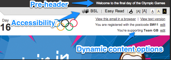
All accessibility options should be clearly placed at the top of your email in the header. Options such as a link to a plain text version of your email, larger print version, sign language, contrast levels etc… should be included. Unfortunately your email can’t dynamically reformat its content as it would on a website, so all accessibility links should direct your subscribers to a landing page with the appropriate content.
Text Version
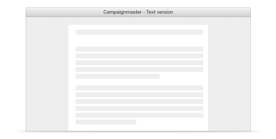
Including a link to a plain text version of your campaign is one of the easiest ways to add an accessibility option. Plain text can be resized easily and can also be dictated by screen readers.
Place Alt Text on All Images
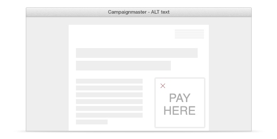
You should be placing ALT text on all your images anyway, but you knew that, right? This goes doubly so for accessibility. When you mouse over an image with a screen reader active, the ALT text will be dictated.
High Contrast Text
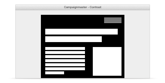
Keep your text clear and easy to read by using high contrast text and background colours. Try not to use two similar colours, like ‘orange on yellow’ or ‘blue on purple’. Best practice is to keep it simple with ‘black on white’, you’d be hard pushed to get more contrast than that!
Tables
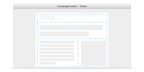
If you have a large amount of visually impaired subscribers, you should make it easy for screen readers to dictate their content. Keep table nesting and stacking to a minimum. You can still create a compelling, multi-column email with just four tables.
Headings
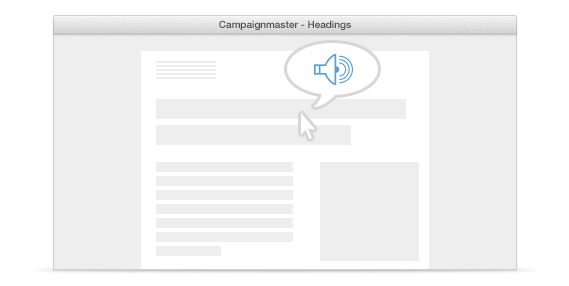
If you are avoiding nested tables, you’ll need to use heading tags to segment your content. These will be picked up by screen readers and your subscribers will be informed that they are viewing new content. An empty heading tag, followed by your content title will act as a “hook” for the screen reader.
01. <h></h> Title content
Links
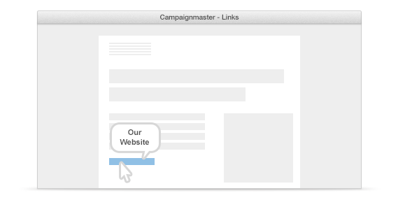
When adding links, include a tooltip. When a subscriber moves their mouse over the link, the content of the tooltip will be read out rather than a potentially long and confusing URL.
01. <A title=”Our Website”
href=”http:// www.campainmaster.co.uk/compo”>Enter now!</a>
Structure
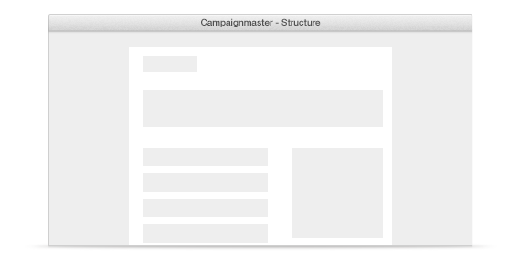
Visually impaired subscribers may wish to upscale the text in your email natively (i.e from within their email client). Ensure that the structure of your email can handle resized text without breaking the layout or the flow of your design.