Each year we see new design trends that go on to influence and shape digital marketing; from use of colours and imagery to typography. Whether you are a marketing manager, programmer or designer, understanding how style and design is changing and evolving, helps to keep your work fresh. In this blog we will look at fonts and their contemporary use in digital marketing.
Typography
Typography has always been a hot trend for digital marketing; allowing you to set the tone and look of the message you want to convey to your readers. Web fonts provide designers with tools to be more creative, bold and experimental when creating digital content. Today, we see larger, bolder and vibrant headings taking centre stage in emails. Why? One, larger and bolder text grabs the recipient’s attention at first glance. Two, it’s easier to read on smaller screens including mobile and smartwatches.
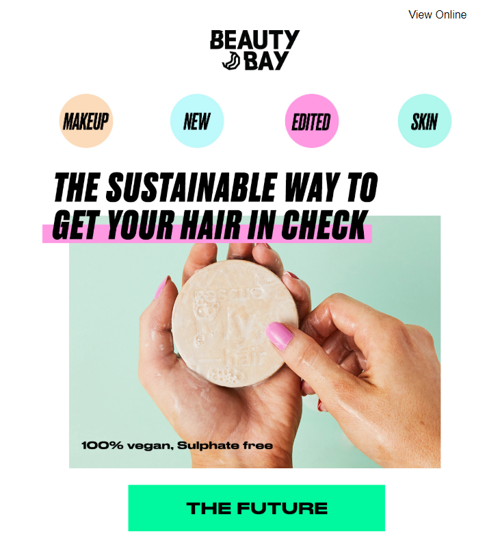
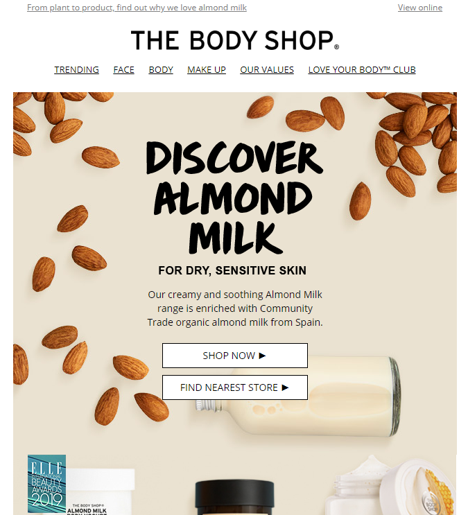
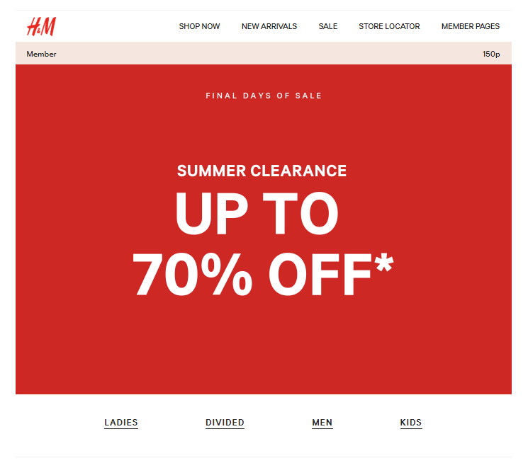
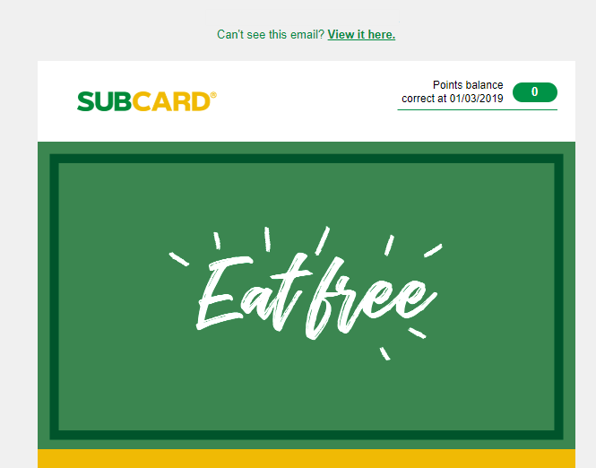
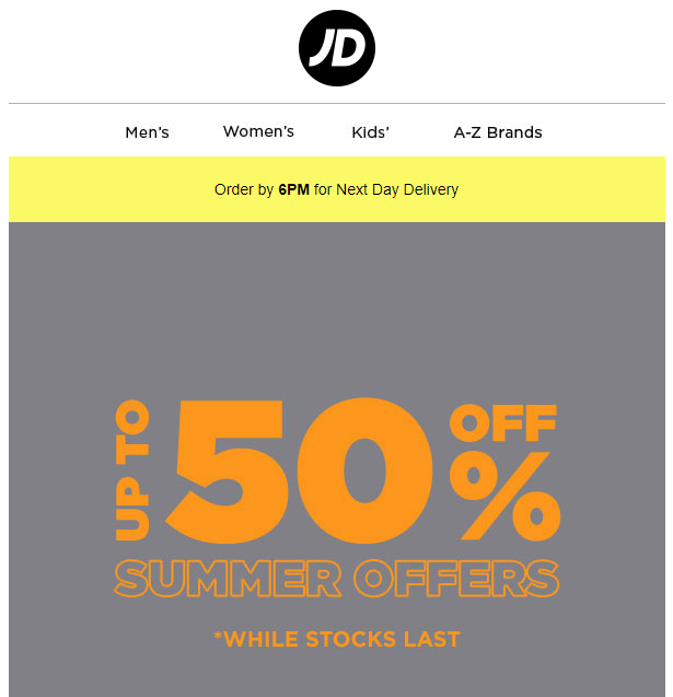
Below we have some examples:
More Text Less Images?
These examples show how text is not only taking centre stage but replacing images altogether. Emails with large fonts and fewer images are on the rise and reaching your inbox. Text based emails have useful advantages over images; for example, you have more control over how text renders on different devices and screen resolutions by using media queries. More importantly, your attention-grabbing heading is visible at first glance on Outlook, no need to download images to view your content.
Email Safe Fonts
Email marketers are limited by the number of email safe fonts they can use. However, we can take more risks by including a fallback font. With this fallback, we can use email safe fonts for occasions where our fonts are not supported. We have also seen examples where email marketers have used graphics containing text which allow for more creativity and animation.
Selecting the Right Font
The font you choose ultimately plays a hand in conveying the message you want to give your recipients. Wichita State University’s Software Usability Research Laboratory conducted a survey asking more than 500 participants about their perception of fonts. The survey evaluated fonts used in emails, letters, spreadsheets, webpages, headlines, and news articles. The results identified that Cambria and Georgia are seen as polite, mature, formal and assertive. Kristen and Comic Sans are seen as happy, exciting, casual and passive. While the font Arial, one of the most commonly used fonts in email is seen as unimaginative but stable…
Mobile
We discussed the advantage email marketers have over text using media queries on mobile devices. Furthermore, text requires less bandwidth to download, making your heading visible at first glance for slow 3G networks. Moreover, making our design finger-friendly is vital when adding links to our text. When adding a link to your text it is best to make your target big making it easy for user to tap. Apple’s iPhone Human Interface Guidelines recommends a minimum target size of 44 pixels wide 44 pixels tall. They suggest the human tip is around 44 pixels squared.
A Final Note
Research suggested that 8.5 seconds is the length of time it takes a recipient to read a headline. In other words, that’s how long you have to convince your recipients to continue reading. For this very reason we are seeing shorter, larger and bolder heading becoming the norm in emails. Marketers are also using also using bright, bold and vivid colours; capturing the recipient’s attention in a split second.
If you need help with creating striking email templates that render perfectly across all major email clients, get in touch at info@campaignmaster.co.uk.