According to the World Health Organisation (WHO), there are at least 2.2 billion people globally who have a visual impairment or blindness. The Royal National Institute of Blind People (RNIB) state around 350,000 people are registered blind or partially sighted in the UK.
These people are able to use computers and read emails with the help of assistive technology, which includes tools such as screen readers and digital screen magnifications.
These statistics raise an important question for all email marketeers; do you consider recipients that may have visual impairments when designing and building your email campaigns, so the message is more easily read?
If not, to help you with this when creating your next email campaign, we have put together a list of email components you can adjust before your next campaign launch to cater for this audience.
If you have already been designing and building campaigns for visually impaired recipients in mind, I would still take a quick look at our recommendations, as there may be some additional points you can implement going forward to help improve the user experience.
- Descriptive subject lines and pre-header text
A subject line that describes the content of the email is the first factor that will determine whether your email is opened or not. Ensure the subject line is clear and is a descriptive explanation of what is to follow in the email content.
We also recommend inserting pre-header text into your campaigns. This will be the first line of text within the campaign used to provide a little bit more information about the campaign and it will be displayed below the subject line in some email clients. You can read more about pre-header text and its benefits here.
- Emojis
Use of emojis within the subject line can be fun and it can help your email stand out in a crowded inbox.
When thinking about accessibility, always insert the important details before the emoji and make sure to only insert one or two emojis in the subject line. Otherwise, the experience is not as enjoyable for someone using a screen reader.
If you want to find out more about use of emojis in subject lines click here.
- Email content structure and formatting
In terms of the general layout of your campaign, the content should be divided into clear sections which will make it easier to read for those recipients who are using screen readers. There should be sufficient spacing between the paragraphs to make it easier to differentiate content between the paragraphs.
You can also think about the order of the content; the most important content or message could be placed at the top so that your recipient understands the purpose of your campaign quickly and clearly without having to wait until the end of the email.
- Plain text version
A plain text version of
your email only contains the text content of your campaign. This version does
not include any colours, styles and images; it is literally just plain text and
links. This version is great for recipients who use screen readers as they can
understand the content of your campaign more easily without other elements creating
interruptions – such as images.
Sounds too long to create? No – it’s not! Within both of our editors, you will
be able to convert your campaign into text version with one click, as well as
being able to modify this version easily.
- Text content style
You might like to use decorative or cursive fonts in your campaigns. However, we recommend against this. The reason being, font types that are decorative, cursive or have a light-weight typeface might be harder to read. For example, Baskerville font can be harder to read compared to Arial.
When thinking about fonts, you should also consider the text decoration and the text size. The text decoration is where you add styling to the text such as making the text italic, underlined or bold. Keep in mind that the italic styling will may make it more troublesome for those visually impaired recipients to read and possibly understand the content. On the other hand, you can use bold styling to bring attention to and help important messages stand out. However, using the bold style also depends on the font type you are using. Whilst bold looks clear on some font types, the letters might look too close together and difficult to read on other font types.
The clear print standard requires a minimum font size of 12 point (approximately 16 pixels), which will help your recipient to see the letters easier. The text should be left aligned and, according to the American Foundation for the Blind, the line spacing should be 1.5.
- Image content
Use of alt text becomes very handy when images are used in emails, as it can describe the image so the recipient can get a better understanding of the email content.
Avoid using background images with text placed on top as screen readers may not be able to read the text that is overlaid on top of the image.
- Use of colours
In addition to the above points, don’t forget to consider how your email will appear to those recipients who have a colour vision deficiency. If there are complex colour schemes within the campaign, this will potentially make it harder to distinguish the content and may cause confusion for those recipients with colour vision deficiency.
You should also keep a good colour contrast between the background colour and the content colour to allow for a clear distinction between the two. For example, we recommend refraining from using colour combinations such as green and red or blue and purple.
Not to mention having similar background colours and text colours can also cause your spam rating to increase.
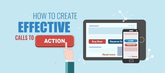
- Use of call to actions
In regards to the call to action (buttons) within the campaign, we recommend using bulletproof buttons instead of regular images.
One reason being that
screen readers might not be able to read the action text on the image, in which
case your recipient will not know the context of the link.
The second reason is that for some email clients, images need to be downloaded
in order to display. Therefore, the
recipients who have default settings to block images within emails, will not be
able to see the calls to action unless they download the images.
Since call to action buttons are one of the most important pieces of content within a campaign, why not make sure that the button is displayed regardless of the default image settings of the email client?
This can be achieved by
inserting bulletproof buttons which contain additional code to ensure that the
buttons are displayed without downloading the images. Screen readers will also
be able to read the text on the call to action buttons too.
Don’t worry, you don’t need to figure out and code the buttons yourself. Our
Drag and Drop editor has pre-built bulletproof buttons which you can insert
into your campaign and customise however you wish.
Alternatively, we have a bulletproof button generator which allows you to easily generate the button code to add to any open/Telerik editors too.
If you need any help and advice with your email marketing please get in touch at info@campaignmaster.co.uk and we would be delighted to help.