Grabbing and retaining your recipient’s attention should be the first objective of your email campaigns.
However, you may find your results show that more text heavy emails have lower open and engagement rates.
Don’t get me wrong, text-heavy emails definitely have their advantages. For example, instead of asking readers to click to read, content is placed directly in the email campaign. But with all this text you want to make sure your recipients don’t switch off.
So how do you go about breaking up those text heavy emails to increase your engagement?
Switch up fonts
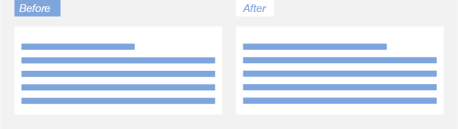
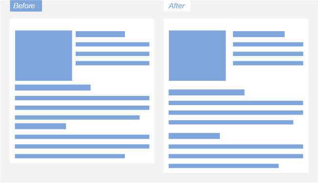
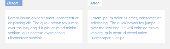
The font and typography in your email campaigns contribute massively to retaining recipients’ attention and can prove very valuable when it comes to breaking up text.
Take the example below, even though it’s the same volume of text, the block on the right-hand side is far more enticing and easier to read. The only difference? Fonts.
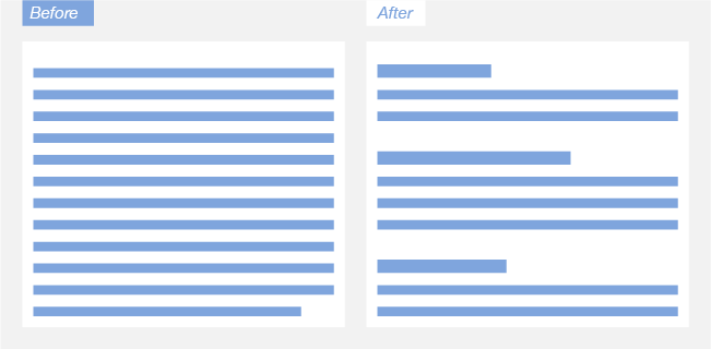
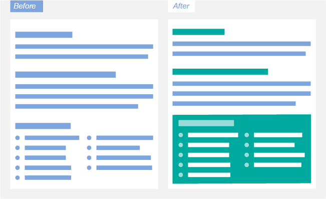
Sub headings
Sub headings are a great way to break up text heavy emails. Not only do they add some much-needed space, but they also help your recipients follow your train of thought as they can more easily distinguish the different points you’re making.
Sub headings also allow readers to get a quick overview of your email content. By skimming through them it’s easier to understand what the content is about and you may gravitate to more relevant sections.
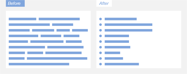
Lists & Bullet Points
Clear. Concise. Neat.
It’s so much easier to process information that is formatted into lists or bullet points. A key point to remember here is to ensure your lists do not have too many options – as this can be just as overwhelming as a long paragraph.
If you do find yourself with longer lists, consider other methods of formatting or try to reduce each point as much as you can.
White space
A great way to break up text heavy emails is to add the occasional white space. This could be between headings, paragraphs or images. This provides some visual breathing room, making it easier for your recipients to digest the information you’re providing.
Whilst we’re on the topic of spacing – don’t neglect your line spacing!
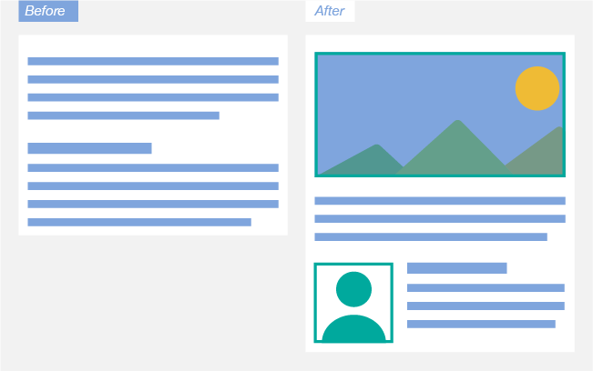
Visual Variety
An obvious insertion would be to add images or GIFs.
Images or any other kind of graphic will help you to connect with your audience, enticing them to read the accompanying text. As an alternative to an image, why not use a horizontal line to indicate a break or pause?
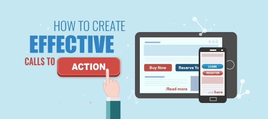
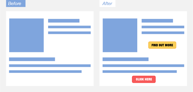
Calls to Actions/Links
Adding call-to-actions in your text heavy emails is a great way to break up blocks of content. In the below example, the buttons stand out and by naming them accordingly, the recipient will know exactly what they will get by clicking on them.
Colours
Using a variety of colours not only adds interest, but can help readers take in information in a more informal manner. We believe using colours is most effective in links, headers and key words.
Keep your email on brand by using company specific colours or add a vibrant pop using more brighter colours such as a green.
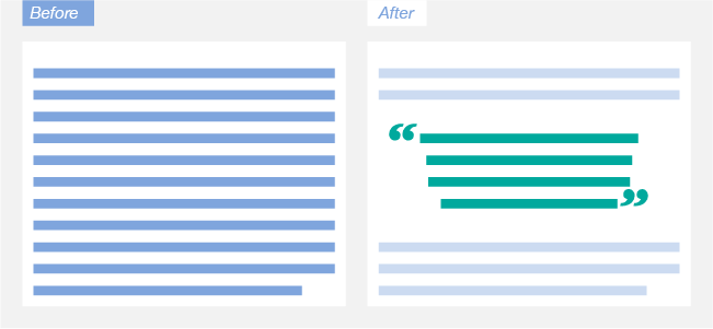
Quotes
Switch up the type of text blocks you’re using by adding in customer testimonials and quotes – now I don’t mean add in another basic block of text. Make use of larger-than-necessary quotation marks to help break up the text content.
Formatting
Formatting your text can really help to put focus on specific bodies of content and make it easier for recipients to take in the information you’re providing.
There is a thing as too much formatting but why not try any of the below:
- Use symbols where you can – replace an “and” with a “&” in a heading.
- Use brackets to break up longer sentences (or to just make the odd side note).
- Use full stops to draw in engagement. For example: “This. Is. Big.”
- Make key words bold and emphasise crucial phrases by making them italic.
Left Aligned Text
It goes without saying, but the alignment of your text is extremely important. We read from left to right and so it makes sense we format our email campaigns in the same way, making it easier to read.
We can help with re-designing of your templates and campaigns, so if you need a fresh pair of eyes to look over your existing content please do get in touch at info@campaignmaster.co.uk.