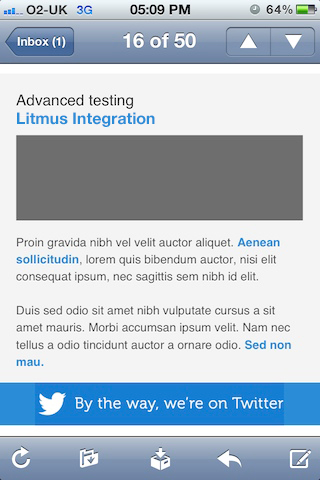
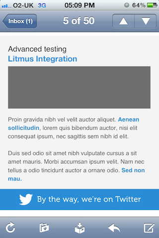
Ever noticed your images acting strangely when viewing your email design via a mobile network?
While putting our mobile friendly email newsletter together, we were hit with the pesky issue of mobile image compression.
In order to save on bandwidth, some mobile networks automatically reduce the quality of images that are downloaded by mobile devices. For images such as photographs this is an unavoidable (and blurry!) annoyance, but when it comes to text-based images used for the structure of an email, the humble PNG image format comes to the rescue.
Feeling a Bit Compressed?
Below you can see our ‘By the way, we’re on twitter’ banner in all it’s full resolution glory.

This banner sits within a table row that has the same blue background colour. The effect is a solid bar with no distinguishable borders around the outside of the image. Just the way we like it!
But, when viewed over a cellular internet connection (3G in this case), the image gets compressed and the colour is altered to a rather upsetting dark blue. The outline of the image is now clearly visible, and our email is looking a little worse off for it. As mentioned earlier, this image is a JPEG, but we also had the same issue with a GIF.

Now it’s time for the clever part. By replacing the blue background with a transparent one (i.e all white text with no background colour) and saving as a PNG (which supports transparency), the image manages to survive the image compression along with our design credibility. Success!

Cross-Client Compatibility
One thing to note, PNG images are not supported by Lotus Notes 6.5 & 7.0, and are displayed as a broken image with the dreaded ‘red cross’. There is a bit of a silver lining though, as ALT text steps in to provide context on the missing image.

When you’re deciding on your email design, weigh up your subscribers email client use and choose your image formats wisely!


