Have you ever looked at the open or click rates of your email campaigns and wondered why you didn’t get better results? I am sure this thought has crossed the minds of many email marketeers. Perhaps your subject line wasn’t appealing or relevant, or maybe your content didn’t attract the attention you thought it would. Wouldn’t it be great if you could test what content attracts more attention before launching to recipients?
This is where split testing comes in.
Split testing allows you to create multiple versions of the same email campaign and launch each version to a portion of your recipients. After analysing the results and seeing which version did better, you can determine the winning version and launch it to the remaining recipients.
So, what can you actually split test? Pretty much everything in your campaign – but let’s start from the top with the From Name.
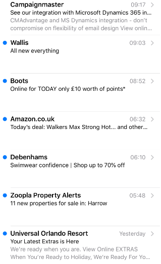
Below is a snippet from my personal inbox. Straightaway by looking at the From Name, I know what company the emails originate from. This is the first factor in determining whether I will be opening, ignoring or deleting the email.

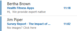
The email examples below use actual names instead of a company names. This is an example of a From Name split test. Some recipients may be more inclined to open the email if an actual name is used, so this is something you could test. You could even combine these in a third split test by using something like Bertha Brown at Health Fitness Apps.

After the From Name comes the Subject Line, which probably plays the most important part in email opens. A Subject Line needs to be attractive enough for the recipient to want to open the email and thereafter you need engaging content to encourage scrolling and clicks.
Some ideas you could try for split testing subject lines are:
- A subject line structured as a question as the recipient may be curious about the answer
- Personalisation, for example: ‘Hi Ceren, here is your August e-newsletter’
- Snippet of the content, for example ‘The Autumn Edit inside this email’
- Include emojis to make your email stand out in a crowded inbox
- Variations on text for example – 20% off or £20 off
After your subject line comes pre-header text. This text appears underneath your subject line in your mobile preview and is sometimes known as the secondary subject line. We wrote this blog on how to make best use of this essential piece of content here. Changing pre-header text also make a great split test for mobile views.
So now your recipient has opened the email because of your brilliant subject line and pre-header text, how can you encourage them to scroll and take actions?
The first thing to consider is your layout. You could consider having one version in a one column layout and other versions with multiple columns. Some users could be using tablets, which obviously offer a bigger viewing screen and may enjoy reading more content in one screen. If most of your audience is using a mobile phone, then a single column layout may be the better choice.
Now your layout is sorted, we move onto Calls-to-Action. If you are interested in learning more about creating effective CTA’s click here .
Some email marketeers prefer CTA buttons and others prefer text links – if you are using text links it would be worth running a split test of your campaign but with one version using CTA buttons, which tend to have a higher click rate. If you use CMAdvantage’s buttons, these are bulletproof buttons. In our industry this means these buttons will not break and will appear intact even before any downloading images.
Instead of just stating Read More on a button, make them more meaningful. Marks & Spencer does this really well with their email campaigns. Their buttons don’t just state Read More or Buy Now but are more creative, for example:
GIFTING INSPIRATION THIS WAY
GIN COCKTAILS IDEAS
TELL ME MORE
SEE THE MENU
SHOP THE BOXES
SEE THE RANGE
Another test you could vary in each version is the amount of text in your campaign; long text versus click on read more buttons to read the rest of the content.
When you have created all your versions, you can launch each version to a percentage of your list. For example, launch to 25% of your list first. After analysing the results, you can choose to manually select a winning version or pre-set conditions to launch the winning version (based on opens or clicks or both even) to the remaining recipients automatically.
A very important point to note is that when creating split tests, conduct one test at a time. So, do a subject line test, a layout test, a call to action test or a content test, but not more than one test at the same time. The reason being you will not be able to pin point what worked best.
If you’re thinking this all sounds very time consuming with different versions and splitting the data, don’t worry! Our split testing feature makes the whole process really straightforward and quick to set up. You don’t even need to split your data lists, just set the percentages of the test data and the system will do sort the rest for you.
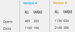
If you’re still not convinced about split testing, see these results below for a marketing campaign we sent to a list.
Version B won by a significant number of more opens and clicks, more than 50% for opens and just under for clicks. In this test, we used two different subject lines with just one tiny word change in version B.
Version A – Stand out from the crowd – email marketing knowledge articles inside
Version B – Stand out from the crowd – email marketing knowledge base inside

If you are interested in seeing our split testing feature or exploring our email marketing tools and services in general get in touch at info@campaignmaster.co.uk and see the difference it can make.


