Growing your subscriber list quickly and organically is the holy grail for any email marketer. By ‘organic’, I’m not referring to overpriced wonky carrots, but rather email addresses that have been provided directly from an individual.
There are plenty of quick ways to artificially boost subscribers, such as purchasing lists or sharing data. While these will certainly help you send more emails, you can never be 100% sure who you’re sending to or if your emails will be relevant to them. As a result, engagement levels may suffer and you’ll likely receive higher spam complaints.
Organic list growth is a slower process, where individuals find their way on your lists by subscribing manually. Whether that be via creating an account on your website, filling in a form or writing down their address in-store. The main benefit here is that all addresses collected are from individuals who want to hear from you. They love you, your products and want to stay in touch.
Even though list growth will be slower via organic means, the quality of that list and its resulting performance will be far greater than that of an artificial one. Organic subscribers expect to hear from you, whereas artificial ones may not.
Ok, so back to the ‘holy grail’ we mentioned earlier. Quick list growth, that’s also organic.
Enter subscription pop-overs!
Love them or hate them, subscription pop-overs have been at the centre of a fair few rapid sign-up success stories claiming list increases at double or even ten fold the current subscribe rate.
The most intriguing thing about pop-overs is that all subscribers captured through this medium will be organic.
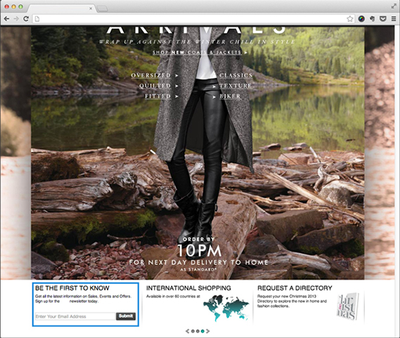
Below, you can see how email sign-ups usually appear. Left languishing in a footer or sidebar, they quickly become part of the furniture and find their way into peoples blind spots.

Pop-overs on the other hand make themselves known by, as their name suggests, popping over the current page content. Initially this may sound like a bad thing, but personally I don’t find them half as annoying as the ‘pop-ups’ from yesteryear. Pop-overs contain content relevant to the page I’m on, offer something of value and fit in with the page design. Much unlike annoying pop-up ads that open multiple browser windows and fill them with tawdry ads.
You’ve probably come across a few different types of pop-over, and there are varying ways of implementing them. I’d like to cover two of my favourite options.
The Take-Over

The take-over is the most, shall we say, enthusiastic approach to pop-overs.
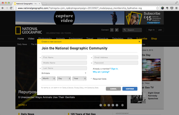
Upon visiting a webpage a window will pop-up, disabling the content behind it (known as a lightbox). This forces the visitor to make a choice, either sign-up to a mailing list, or dismiss the lightbox and return to the website.
Pros:
You Can’t Miss It
This pop-over is anything but hidden. The subscribe form is in full view with all other page content greyed out. It’s guaranteed to be noticed by visitors.
It Can’t Be Ignored
Before continuing, visitors must acknowledge the pop-over and make an active decision to either subscribe or dismiss it.
Cons:
Erm…You Can’t Miss It
The full-page nature of this pop-over will distract the visitor from what they came to your website to do. It’s quite obtrusive and can be annoying, especially if it appears too frequently.
Once It’s Gone, It’s Gone
Once you dismiss this pop-over, there might not be any way of getting it back if you change your mind.
The Roll-Up

The roll-up is a less obtrusive, but still very capable type of pop-over.
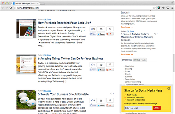
When viewing a webpage, the roll-up makes itself known by animating up from the bottom corner of the page once the visitor has scrolled down past a certain point.
Pros:
Unobtrusive
The roll-up does not force the visitor into an action or interrupt their experience.
Better Informed
Visitors will have had time to ingest your content before the roll-up appears. This enables them to make a more informed choice when asked if they wish to subscribe.
Animation
The roll-up appears by animating up from the bottom of the browser, much like a notification window. This animation is quite attention grabbing, and increases the chance of the pop-over being noticed.
Cons:
It Can Be Missed/Ignored
The roll-up is far more subtle than the take-over, and as such it could be easily missed or ignored by a visitor.
It’s Small
There isn’t a huge amount of space to insert text and form fields. If you needed to collect more data, you’d need to setup an additional form or landing page.


