Images are a fantastic way to make your emails more engaging, and serve as your faithful sidekick for getting around the restrictions of ageing email clients. Gradients, rounded corners, buttons, custom fonts, animation and more are all made possible using images.
As I’m sure a lot of you are aware one of the biggest challenges in email marketing is making sure that your email looks the same in every email client. Therefore, appeasing all email clients is going to be something of a recurring theme throughout this guide.
One Big Image
As we kick off, I’d like to throw in our biggest tip regarding images in email. Do not send your email as one big image with little or no text content. Spam filters like to have a good read through your email when deciding whether it’s spam or not, and rely on it’s text content in order to assess it. Including all of your graphics and text in a giant image makes things difficult for spam filters to read, and as such has been a favoured way for spammers to hide questionable content.
Abuse of this little loophole has made spam filters look unfavourably upon heavily image-based email as they assume you’re trying to hide something. By including too many images and little text in your email, you’re going to increase your chances of being classed as spam.
However, there are plenty of ways around this such as text/image ratio, slicing and ALT text, which we’ll cover a bit later.
Image Formats

Nice and simple this one. By saving your images in either JPEG or GIF formats you won’t go too far wrong. JPEGs are pretty much still the de-facto web image format and are supported in all email clients. Likewise, GIFs are also well supported, meaning you can use their snazzier features such as transparency and animation.
Watch out on the animation front however. While GIFs and their transparency are supported in all email clients, their animation is not quite as universally accepted. The main culprits here being Outlook 2007, 2010 and even 2013. GIFs will still appear in these clients, but they will only display their first frame, so be sure to include all your main content in the first frame of your GIF.
If you want to include more moving content in your email, you might want to give video in email a whirl.
Lovers of semi-transparent PNG files (of which I am one), use these with caution, as they don’t work with Lotus Notes 6 or 7.
Dimensions

While you can upload a large image and squash its dimensions with HTML/CSS (e.g. squashing a 300px wide image down to 150px), it’s best to use images that are the correct size to begin with. This avoids slow loading, distorted images.
Remember to add the height and width dimensions of all your images in your HTML <IMG> tags. Email clients will use these dimensions to display placeholders if images cannot be loaded, maintaining the structure of your campaign.
There is an exception to this rule if you’re catering for high resolution displays (such as an iPhone) and don’t want your images to appear blurry. We’ll cover this soon in a more in-depth guide, but in a nutshell, you’ll want to double your image sizes and halve their dimensions in your HTML/CSS to drive up their pixel density.
File Size

I’m pretty sure you know what I’m going to suggest with regard to image file sizes. Keep ’em small. This makes your images nice and quick to load, even on slower internet connections. You don’t want to lose subscribers because of massive, slow loading images.
When I send out email campaigns, I keep most of my images below 70kb in size. Now, that’s pretty small, and you may be wondering how I can send an email made of 70kb images without it looking awful. This brings us neatly onto our next topic of slicing.
Slicing

Any large images that you can’t squeeze down into that magic 70kb limit should be sliced up into smaller pieces and placed within a table.
In addition to enabling faster loading, this technique also allows you to place different links on each image, as well as individual ALT tags (more on this later). Above you can see a great example of slicing being used on a menu options graphic.
Those of you who are familiar with using Image Maps to place links on images should be advised that this is not supported among all email clients, so test wisely.
ALT Text

Alternative text (ALT text) is something of a god send when it comes to blocked images. When an image is blocked or cannot be displayed, email clients will display ALT text in their place.
ALT text provides a fantastic opportunity to elaborate on your image’s content. This gives your subscribers a clue as to what your email is all about, and helps them decide if they want to view your images or not.
Some email clients allow you to style (format) ALT text on an image, helping it to stand out more. It’s a pretty cool trick, but your mileage may vary between email clients. I’m looking at you again, Outlook!
ALT text can be styled by adding font-family, font-style, font-size and colour properties in your HTML IMG tags
<img style=”font-family: Georgia; color: #ffffff; font-style: bold; font-size: 35px;” src=”image.jpg” width=”500″ height=”149″ alt=”Sun”>
ALT text is also a great way of adding accessibility to your email.
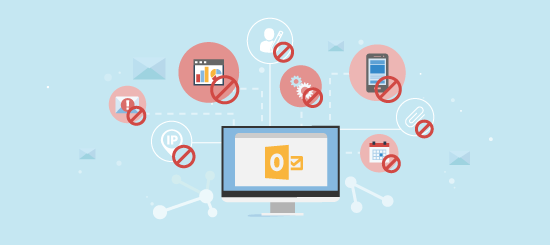
Blocked Images

You’ve probably been long aware that email clients block images from unknown senders, and have possibly dedicated a good few days of your existence clicking on the ‘”display images” button. The reason behind this is that by downloading images in an email, the sender can detect that you have read the email and that your email account is active. So, the automatic blocking of images is an anti-spam protection measure. You can still read and asses the email without images, and you won’t be notifying a potential spammer that your email address is active.
Blocked images can be seen as something of a party pooper when it comes to email marketing. However, they are actually an opportunity to make your email stand out if you know what you’re doing.
By using a combination of tables, sliced images & ALT text you can give an email just as much pizzaz as if your images were turned on.
Check out this great example of a blocked images optimised email from Pizza Express. They have sliced their images into a complex table that resembles the look of their content. By using different background colours on each table cell, they have given something of a ‘pixelated preview’ of the email’s content.
In addition to this, they have placed styled ALT text on images that contain text. By combining both of these techniques, Pizza Express have created a pretty cool email that not only stands out among other ‘images off’ emails, but also contains all of the same content as the ‘images on’ version. Very clever stuff. If that doesn’t convince subscribers to click the ‘display images’ button, they are probably a lost cause!
Usable Fonts
In a previous Email 101 we covered usable fonts in email, but unless you’re in love with Arial and Times New Roman, email is pretty limited for font selection.
However, images provide a nice workaround for custom fonts. You can place any font you like in an image and send it in an email. So long as images are switched on, your subscribers can see your custom font in all its fonty glory.
You can even safeguard against images being switched off by including ALT text as detailed earlier.
Block Level
CSS alert! I’ll keep this brief. For images that are being aligned, such as sliced images in a table, add the inline CSS declaration “display:block” to display them at block level. This will stop gaps appearing between images when viewed in many webmail clients such as Gmail, Hotmail and Yahoo!
Text/Image Ratio
Spam filters scan the text content of an email while assessing it for spam/ security purposes. If you have a large number of images and little text, this will increase the probability of your email being marked as spam or filtered out. As content filters cannot scan the content of an image easily, make sure you balance your image/text ratio proportionately.