Back when I started out in email marketing, I overheard someone use the term ‘call-to-action’. “Call to what? Arms? Have we upset someone?” I thought to myself. A fictitious battle involving staplers, printers and other office equipment began raging in my imagination. It was at this point a colleague noticed that my eyes had totally glazed over, and came to offer an explanation.
A call-to-action is the main point of interactivity in an email campaign. It usually takes the form of a button or a link that a subscriber can use to complete an action. For example, visiting a website, opening a web form or entering a competition. The easier it is to locate and identify a call-to-action in a campaign, the higher the chance that subscribers will use it.
Now, when you’re working on the overall look and feel of an email, it can be easy to let its design take precedence over its purpose. Don’t fall into this trap. You could be sending the most attractive and well designed email of all time, but if subscribers don’t know what to do with it, the whole exercise will become fruitless.
So you can make every campaign a success, we’d like to share some of our top tips for creating an effective call-to-action in your email campaigns.
Make Sure Your Call-To-Action Is Visible
I know, I know, this sounds like pretty obvious advice, right? What next? Make sure your subscribers are inhaling and exhaling regularly? Joking aside, this is actually a pretty important tip and you’d be surprised how many campaigns fall at this first hurdle.
There are two important steps behind ensuring subscribers can see your call-to-action. The first is keeping your call-to-action ‘above the fold’ and the second is making sure that your call-to-action isn’t completely image based.
Into (and above) ‘the fold’:

All email clients are not equal. Far from it infact. Subscribers will be using a multitude of devices and email clients on which to view their email. Ones with big screens, ones with tiny screens and everything in-between.
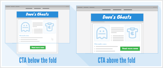
When an email client is displaying a campaign, only so much can be displayed before the subscriber will need to scroll down in order to view additional content. This cut off point is known in the email and web design industry as ‘the fold’.
When subscribers are dealing with multiple campaigns in their inbox, they tend to make quick judgements on how to deal with them. By keeping your call-to-action above the fold, you’re making it as easy as possible for subscribers to interpret your email and see how to act upon it.
If a call-to-action is below the fold and a subscriber doesn’t scroll down to see it, there’s a chance the email could be ignored.
Button Up
Ok, so we’ve got our call-to-action above ‘the fold’ (buzzword overload!), but believe it or not, our subscribers still can’t see it. Why? Because the button is based entirely on an image. Uh-oh.
Many email clients such as Outlook, Gmail and Yahoo! block all email images by default in an effort to reduce spam. In order for a subscriber to see an email’s images, they must chose to download them.
This is great news for the subscriber as they are being protected from potentially spammy emails, but as an email marker it’s something you always need to keep in mind when setting up your call-to-action (as well as the rest of your campaign!).
If your main call-to-action is based on an image, and is viewed with images off, your subscribers aren’t going to see a thing.
For this reason it’s a good idea to either build your button using pure HTML and text, or to place a background colour and styled ALT text on any image based buttons.
Both methods will ensure that subscribers can still see your call-to-action even if images are switched off.
Give It Some Context
When providing a call-to-action, you want to make it as clear as possible what that action is going to be.
A call-to-action without context, such as CLICK HERE or a vague BUY NOW, requires further reading in order to understand what action will be performed.
By labelling a call-to-action with its function, subscribers can immediately understand what’s going to happen when they use it. ‘RSVP to our Summer Bonanza’, ‘Enter our holiday draw’ & ‘Grab last minute tickets’ are perfect examples of contextual call-to-action labels.
Using Multiple Calls-To-Action
The whole aim of a call-to-action is to give subscribers a single point on which to focus their attention. By limiting a campaign to one call-to-action, there’s a much greater chance it will be interacted with. This holds true for a lot of different campaign types, however there are exceptions.
Still going by the same ‘keep it simple’ ethos, multiple calls-to-action can make some campaigns more effective.
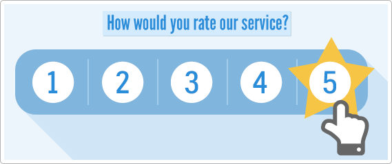
A great example of a multiple call-to-action email is a micro-survey asking a singular question. Usually something along the lines of ‘How would you rate our service?’. This is then followed by 5 calls-to-action, each labelled one to five.

These campaigns are used to great effect by many large retailers. Especially when looking for feedback on their products or services.
Invitation emails are another good example of using multiple calls-to-action. When requesting an RSVP on an invitation, you make make things super-easy for subscribers by providing “Yes’, ‘No” and ‘Maybe’ buttons directly within the email.
By using multiple calls-to-action in these scenarios, you can see how you are actually making things simpler for subscribers to engage with an email. They can provide their answer in one click, with no need to fill in forms. All the response data will be collected by your campaign reporting, so it even makes things easier for you too.
Don’t Be Afraid to Repeat
When glancing at an email the primary call-to-action should stand out instantly. However, this does not necessarily mean that’s where subscribers are going to click.
When I’m putting an email together, I’ll often repeat the call-to-action link on multiple elements. So for example if I have a heading, an image, some text and a call-to-action button, I’ll place the call-to-action link on the heading and image as well as the button. The more links you place, the higher the chance of them being clicked! Do note though, that these are ‘hidden’ links so do not detract away from your main call-to-action.
I was told a good tip recently in regard to ‘letter’ style campaigns. Including a ‘p.s’ section with a last-ditch attempt link in has been known to yield good results. For some physiological reason we all succumb to the siren song of a cheeky bit of ‘p.s’ text…
Make It Mobile
When considering a call-to-action for mobile devices, you can still use all of the techniques above, but here are a couple of extra tips to give your mobile call-to-action a bit more pizzaz.
Watch out for Portly Digits
Most mobile subscribers will be using their fingers and thumbs to interact with your emails. To make things as easy as possible for them, make sure your call-to-action is nice and big, and has plenty of breathing space around it. Place it too close to another link or email element and your subscribers may have difficulty tapping in the right place.
Get Smart with a Mobile Specific Call-To-Action
A lot of new smart phones and tablets have sensational support for new web standards. Especially when compared to stiff and ageing desktop clients.
This means you can insert whizzy new code (like CSS3 @media queries) that can dynamically insert content specifically for mobile.
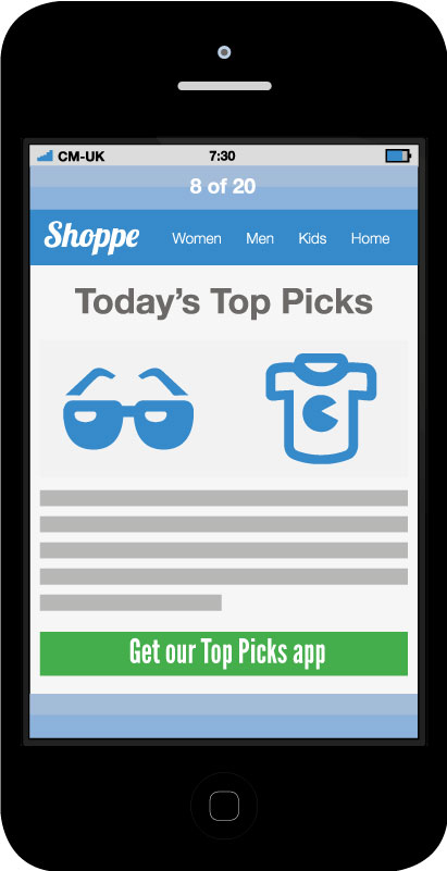
This is a real boon for calls-to-action. If your email is read on a desktop device, your call-to-action can be labelled ‘Check out our new website now’, with a link through to your shiny new website.

If the same email is read on a mobile device, your call-to-action can magically change to ‘Check out our new mobile app now’, with a link off to the app store of your choice. Smart stuff I’m sure you’ll agree.
So, there we have it. I hope this little primer on calls-to-action has been beneficial to you if you’re totally new to the term, or even if you’re overly familiar!
Now, if you’ll excuse me, I’ve just spotted a perplexed looking intern who thinks he’s been called to Acton.


